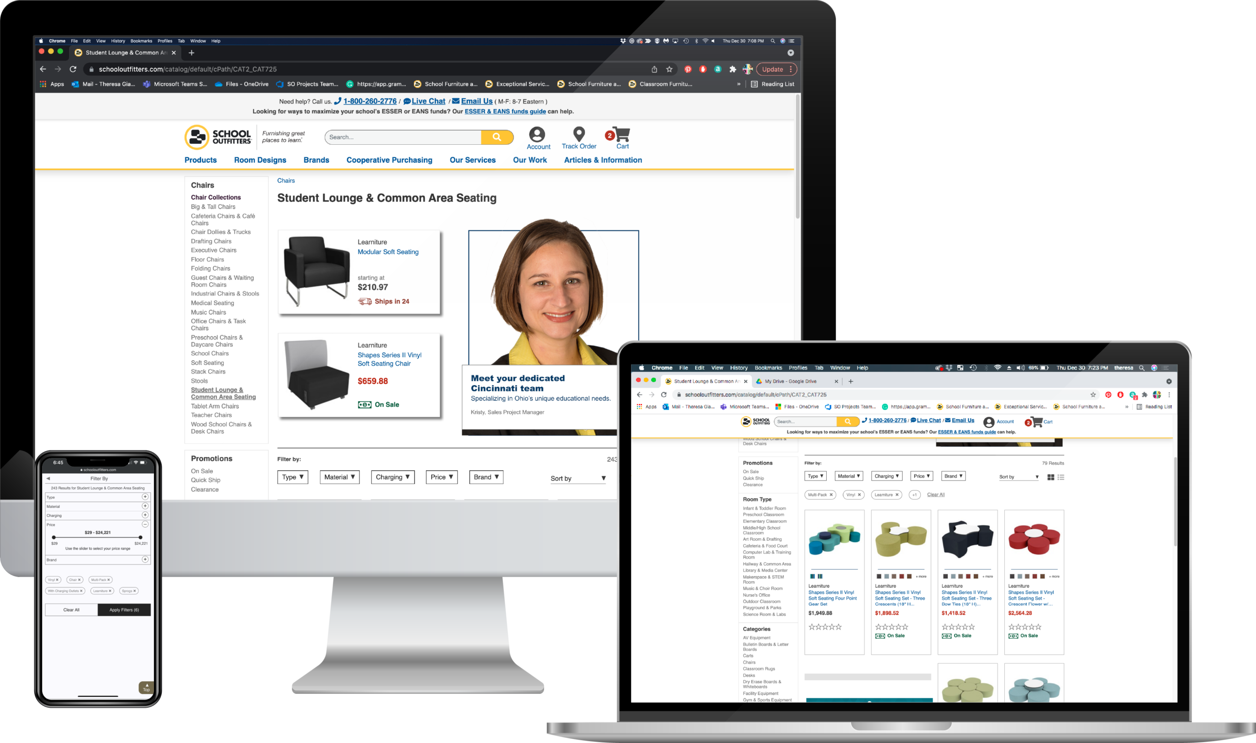
E-commerce website | Subcat Pages & Filtered Navigation
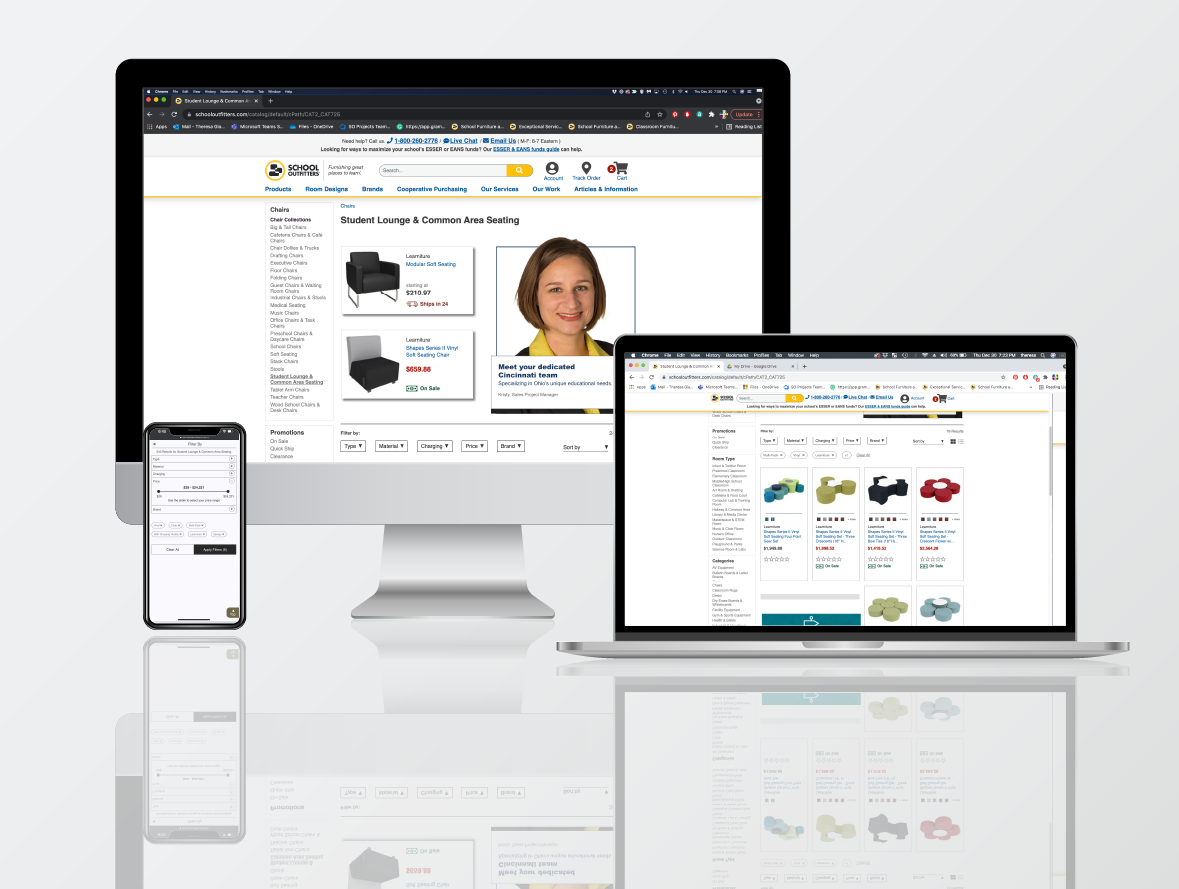
OBJECTIVE
Overhaul Subcategory Pages
Modernize the subcategory pages and upgrade the filtered navigation. Personalize the shopping experience with geo-targeted elements and featured products.
CHALLENGES
- Implementing a new layout and creating new interface widgets that are a drastic departure from the previous design.
- Organizing a wealth of pertinent product information into easily accessible (and shareable) ‘chunks’.
- Ensuring personalization features above the fold do not negatively impact customers’ scroll-through rate.
- Reprioritizing enhanced product grid features for future versions of this page (product comparison tools, Quick Ship toggle, quick view, Add to Favorites for account holders).
- Working within the limitations of the proprietary content management system and third-party e-commerce tools.
ACHIEVEMENTS
- For the first time ever, the subcategory pages were successfully designed for a responsive experience.
- A personalized shopping experience for our customers through geo-targeting technology.
- Increased customer interaction with navigation on desktop and mobile through improved legibility.
- Mobile-specific customer experience improvements through the use of results counters, price sliders and flyout modals.
- Upgrades to the product grid include larger product images, on-hover behavior, the inclusion of ‘at-a-glance’ information (ie swatch thumbnails and sales/shipping badging), and trust-building components and service features.
- Implemented a standard of live text and SVG images site-wide to increase website accessibility, responsiveness, and SEO ranking.
PROCESS
Utilized design thinking to get to the root of any barriers customers may have while making an informed purchase.
By combining data-driven user research, UX and e-commerce best practices, along with creative problem-solving, we were able to deliver an elegant, streamlined solution to our subcategory pages.
Empathize & Define
- Identify customer pain points based on analytics reports, sales information, heat maps, user feedback, and other data.
- Determine where users get stuck or experience cognitive overload.
Ideate
- Using defined best practices and user feedback to guide the user through the decision-making process.
- Getting creative and generating possible solutions through brainstorming, sketching, role-playing, developing moodboards, and revisiting previously ideated material.
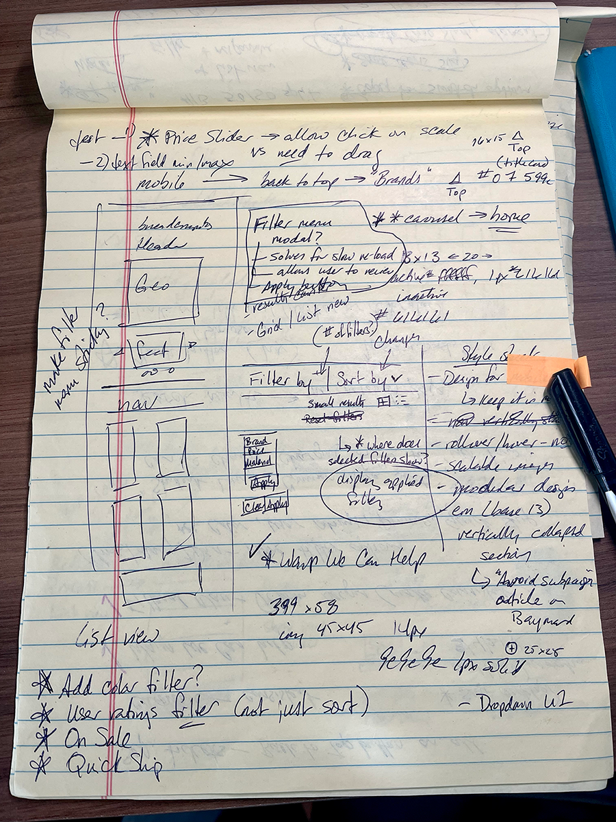
Subcategory and Filtered Navigation | Responsive sketches
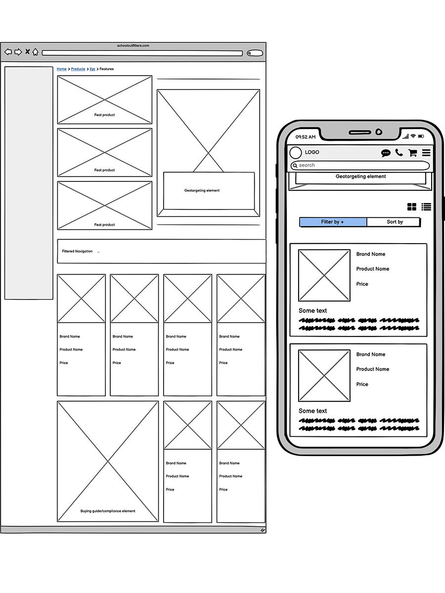
Subcategory and Filtered Navigation | Desktop and responsive wireframes
Prototyping
- Create multiple wireframe concepts illustrating the user click-through path with the more intuitive component structure.
- Deliver low-fi prototypes to the team.
- Run concepts through user-testing.
- Refine prototypes with feedback from team members and stakeholders.
- Review and edit each phase’s acceptance criteria in Azure DevOps.
- Handoff all finalized assets and meticulously annotated redline specs for desktop and mobile to our remote development team.
- Address any areas that need further clarification.
Test
- Test through each phase as it becomes available in QA; document any issues with supporting screenshots showing possible fix in code.
- Test all updates in the Staging environment.
- Discuss the results of A/B testing with the analytics team and stakeholders; design decisions are then validated or updated based on user behavior.
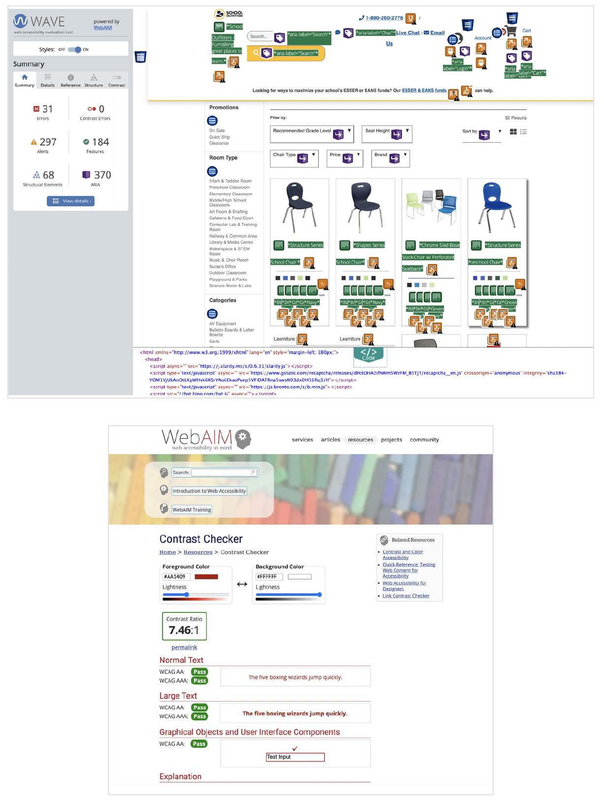
Subcategory and Filtered Navigation | WCAG compliance testing sample
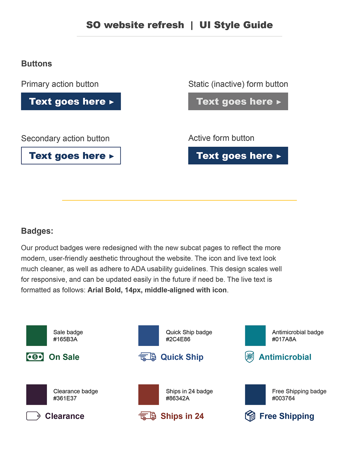
Subcategory and Filtered Navigation | UI style guide sample
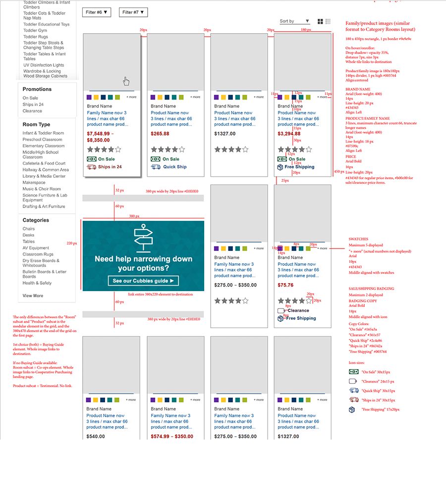
Subcategory and Filtered Navigation | Desktop redlines
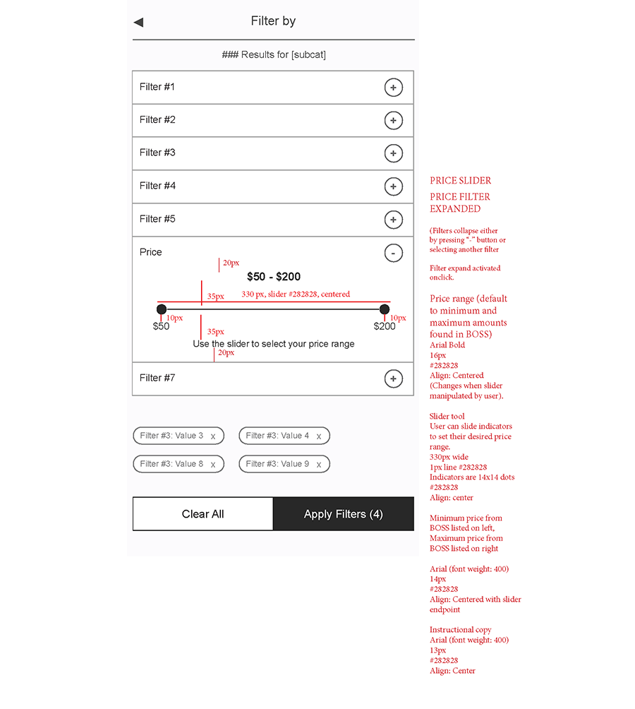
Subcategory and Filtered Navigation | Responsive flyout modal redlines