
“No one has time to play ‘Spot the Differences’ with data.”
Background
A lot of work goes into pricing groceries. This case study focuses specifically on a critical communications bottleneck between a grocery chain’s category management (CM) team, pricing analyst team, and retail data science team.
All of these people have heavy workloads, calculating and adjusting grocery prices to encourage customers to buy high-quality food at competitive prices. There are a LOT of data points involved in this process, and the deadlines to finalize reports can be fairly tight. For a retail item that doesn’t tend to fluctuate in price, this process can be smooth sailing through each point of contact. Other categories, such as produce, eggs, and meat, have many factors that affect their prices, and clear communication of these changes is critical.
The Challenge
Category managers, the pricing analyst team, and the retail data science team; each stop along the way of this retail pricing assembly line is vital to ensuring customers receive a fair price to keep their trust and loyalty. If there is a change in these reports, it needs to be confirmed and approved before being passed along to the next team. Once the report changes hands, a clock counts down to the deadline. If the clock runs out, the report is automatically sent to the next point of contact, no ifs, ands, or buts.
The problem with this process is that even when a change is made, the modifications are not always apparent to the next reviewer. It is also difficult to determine who made these changes and why. Emails, phone calls, and Teams messages get volleyed back and forth to confirm or clarify information in these reports. It’s been emphasized that this part of the process is a major pain; hunting people down or digging through a full inbox to find information bogs down the workload and creates additional stress.
My Role
User research, interface design, prototyping and testing, documentation
Gaining Empathy
I observed each group of users working through their respective sections of ownership of the reports. Some teams rely on a massive spreadsheet as a reference and would make lighthearted banter about the excessive time it took to open and load this behemoth.
Whenever a question arose and an item needed verification, users would dig through emails and other correspondence. “The [automatic system] notification says that there’s a change, but it doesn’t say WHY…so we keep the spreadsheet on this separate screen and scroll until we see something that gives us a clue…”, “I’ve been working in this department for years, so I know who usually handles this kind of thing, so I’ll just call them up and ask them to confirm”. “I keep a copy of the last run’s reports for reference, and I can compare them. It’s not the best system, but it kind of works”.
All while the clock is ticking away, and more reports are coming in.
Defining the Problem
Jobs To Be Done: Members of the pricing teams need a clear indicator of any modifications made to time-sensitive retail pricing reports.
HMW: How might we reduce cognitive load while informing the user of critical actions taken in the reporting process?
Ideation!
I sat down with my engineering lead and product manager to discuss my findings and to map out the technical ‘behind the scenes’ process journey. We reviewed any limitations of the legacy code and found some great opportunities along the way.
My product manager and I met with the teams again to review and expand our understanding of the use case scenarios:
-
-
- “We probably also want something to indicate that it’s been reviewed and no changes are needed.”
- “Maybe a pop-up or something would be nice, like if it said: ‘these items require action by such-and-such date’”
- “Whatever you can do to cut down on the number of emails I get from the system, that would be great.”
-
After confirming these details, my team and I launched into brainstorming by creating crazy 8s sketches. We found some real gems for making modifications noticeable “at a glance,” so the user can process these reports with ease and confidence.
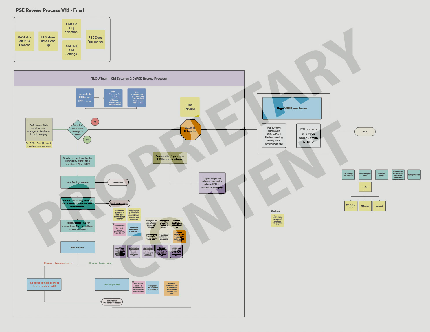
Mapping out the process flow. Proprietary content available by request.
Prototyping
I presented the wireframes to the users, showing new sections that inform the viewer of the record’s “created” and “modified” dates, the “reason code” selected for the modification, and the associate’s employee ID.
Color-coded inline messaging highlighted deadlines and user actions with time-stamping, and call-to-action buttons were upgraded to dynamic buttons with clarifying language. Toast messaging was employed to confirm a successful hand-off.
After changing some verbiage to more precisely reflect the required user action, I got to work on building the high-fidelity prototypes.
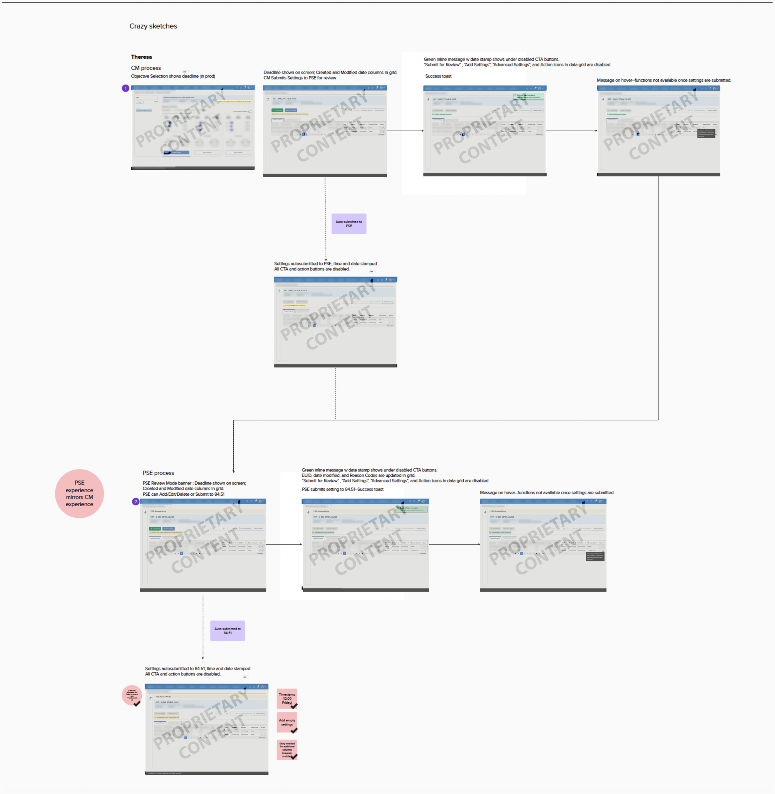
A screenshot of one of the sketches during a brainstorm session. Proprietary content available by request only.
Testing
The demo was well received, with some minor adjustments to the wording. The time-stamping features were proven to be very useful for acting as a guidepost on a trail.
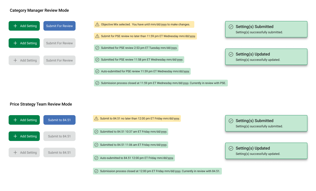
The UI library of inline messages, dynamic buttons, and confirmation toasts created to guide and validate the user's journey.
Due to the proprietary nature of the work, a live demo can be arranged by request only.
Results and Key Takeaways
Overall, the updated design provided several points of clarity on the pricing data review process and any modifications made to the reports. This DRASTICALLY reduced the number of back-and-forth communications needed to confirm or clarify the previous user’s actions. And thankfully, no more playing “spot the differences” with previous reports!
This update reduced complexity, reduced time on task, and increased user efficiency at all points of this process. Stakeholders were fully aligned with these updates and the schedule of MVP/post-MVP rollouts. The user teams were grateful, not only for the work to make their process easier, but for how we were cognizant and respectful of the time taken out of their busy schedules to address this issue.