
“How can you fix a problem if you can’t even tell it’s there?”
Background
Pricing analysts at a nationwide grocery chain manage large amounts of data. Many factors and formulas go into determining price, and these variables often exist in a hierarchy. For simplicity’s sake, if a competitor is selling peanut butter for $3.99, then that variable —matching a competitor’s price—may override a formula that prices this item at $4.19. You don’t want people buying their peanut butter somewhere else, so you match that price.
Now, peanut butter is often sold in different sizes. Consumers in the know expect that if you buy a larger size of peanut butter—often labeled, “Value Size”—you get more bang for your buck (ie, each ounce costs less)! What happens if this rule isn’t followed, and customers pay more? They probably feel ripped off and will shop somewhere else, and who can blame them!
The Challenge
Behind the scenes, when this scenario occurs (referred to as a “parity issue”), pricing analysts must resolve these and other discrepancies before sending off pricing recommendations for implementation at stores across the country. Not all products are available in a variety of sizes, so this doesn’t apply to everything the pricing analysts review. If there is a parity issue, it is nested below other information, so the analysts have to dig through this data one at a time to see if 1) there is parity (multiple sizes offered) and 2) if other applied pricing factors have messed up the ‘more bang for your buck’ rule.
It is very tedious for analysts to hunt for these issues, especially considering the sheer volume of work they do under strict deadlines.
My Role
User research, interface design, prototyping and testing, documentation
Gaining Empathy
I observed individual analysts reviewing their work and correcting problems in real time. They graciously shared their screens and thoughts with me as I asked questions along the way. Each person expressed frustration not only with the time spent hunting for issues, but also with the lack of a clear indication that their changes had been saved and processed.
A screenshot of a user's screen during an observation session. Proprietary content available by request.
Defining the Problem
Jobs To Be Done: A pricing data analyst needs to easily view parity discrepancies in data reports to take action and make accurate and timely pricing decisions.
HMW: How might we make parity issues [action needed and action taken] more visible to the user?
Ideation!
During brainstorming sessions, several questions and challenges arose.
-
-
- How can we streamline this process?
- What other processes in our domain display this variable as an icon? How is this used? Is it clickable? What information does it show and how?
- How might we indicate a call to action?
- Where does this fit (both physically and sequentially) into the other tasks on the screen?
- Are there reasons why this discrepancy may not be addressed (edge cases)? Are there other criteria we need to consider going forward?
- What are the technical considerations we need to keep in mind?
- How do we indicate to the user that the tasks are complete?
- How do we make this as intuitive as possible for our users?
- How can we let users know how many discrepancies they need to work through?
-
Ideas were also generated regarding future enhancements, including how this process might scale across the pricing domain.
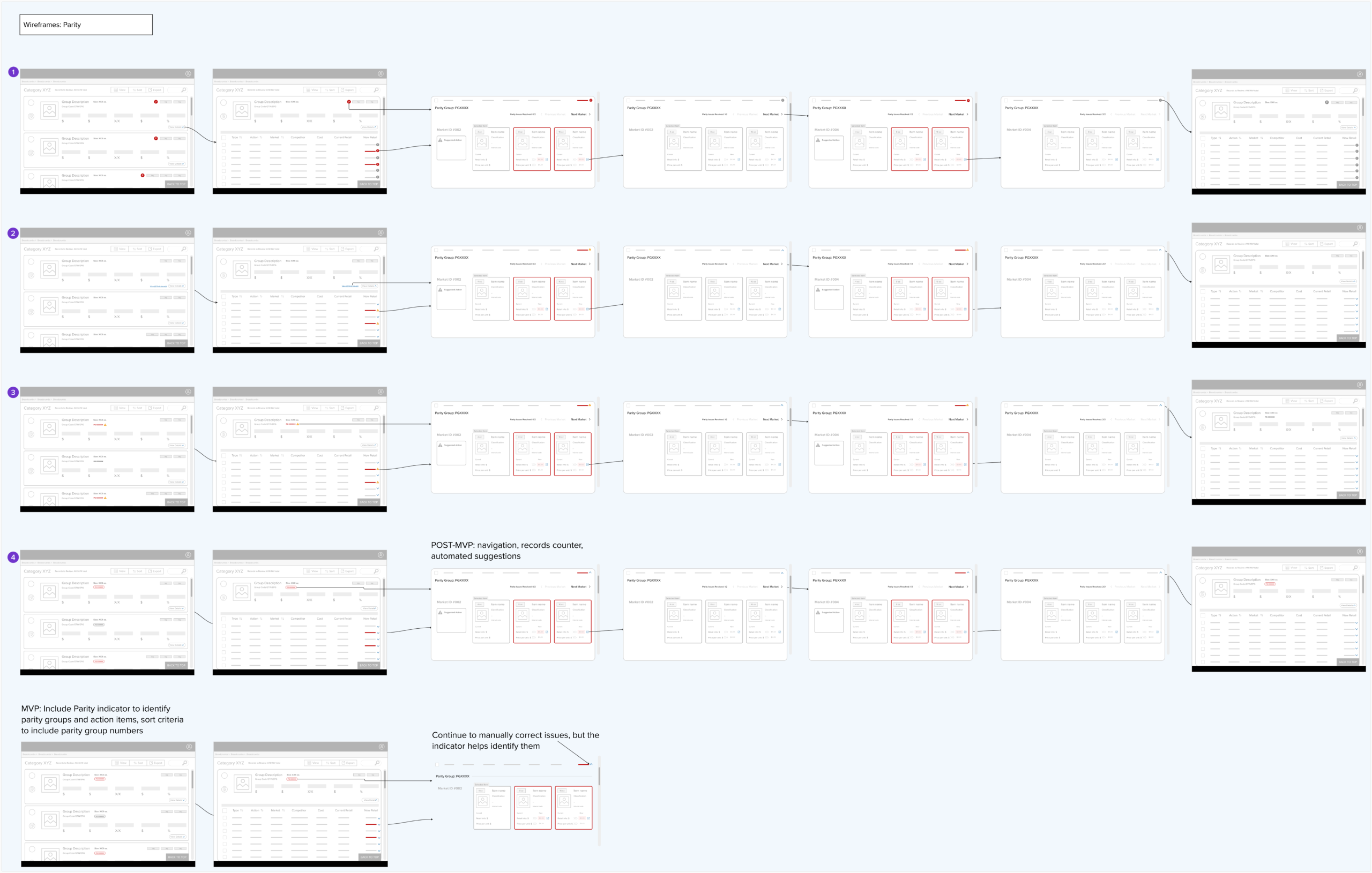
Several options were shown for parity visual indicators, which would allow users to identify and correct parity discrepancies quickly and efficiently.
Prototyping
Before presenting to users, I shared mock-ups with my fellow designers to gather their feedback. After making some tweaks, I presented wireframes of different options to the analysts.
Testing
Users responded positively overall to the different versions of the component’s appearance and expressed their preferences and suggestions. They were comfortable expressing why they didn’t like specific options, which I absolutely encourage! Upon seeing a warning icon on one of the versions, a user said, “That makes me think I did something wrong, instead of something that just needs my attention. I don’t like that at all!”
After further rounds of iteration, I presented an interactive Figma demo to the analysts. They were delighted to see how their needs were translated into a simplified, time-efficient process.
A Minimal Viable Product was handed off for development, including a component positioned on the topmost summary screen for easy visibility. This component includes an error state and behavior to indicate that it is clickable. When clicked, the user is taken directly to the parity issue in question. When resolved, the error state switches to ‘normal’.
Post-MVP enhancements included a record counter, automated suggestions based on pricing history, and enhanced navigation to quickly move from one grouping to the next.
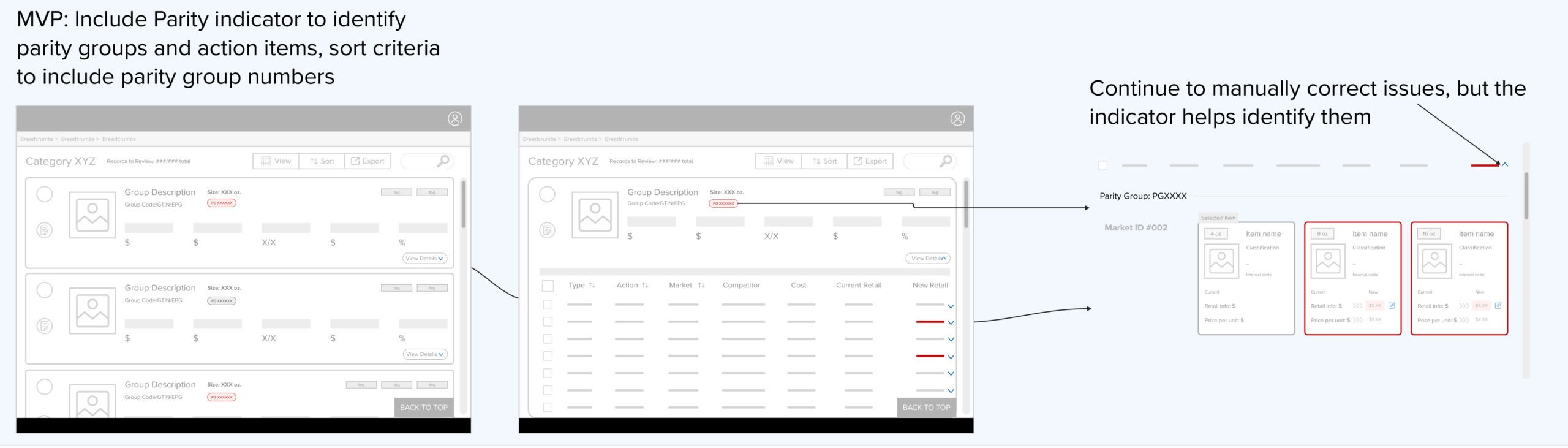
Several options were shown for parity visual indicators, which would allow users to identify and correct parity discrepancies quickly and efficiently.
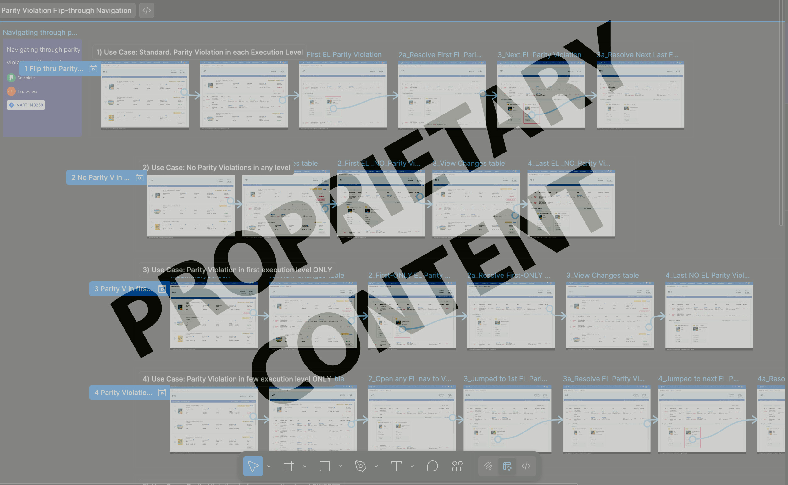
A screenshot of the interactive Figma prototype showing each use case. Due to the proprietary nature of the work, a live demo can be arranged by request only.
Results and Key Takeaways
Reduced users' time on task by
%
minutes
Adding these key upgrades reduced the users' time spent on task by 28% (a whopping 67 minutes on average!), allowing them to implement critical changes more efficiently and accurately.
The visual indicators added to this process provided much-needed clarity to users as they performed tasks, signaling that their changes had been processed.
This discovery process helped build rapport with a group of analysts that I had not worked with before. By including them in this process, I communicated that I valued their input, was listening intently, and was building better FOR THEM.